


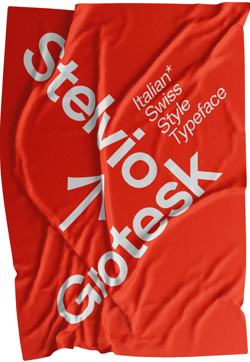
Italian
Swiss
Style
Font
Chapter
One
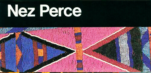
A short Grotesk Story
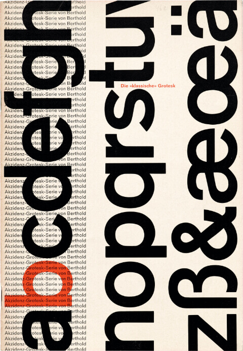
Akzidenz
the father
of the Grotesk Fonts
The first Grotesk typeface in history was the Akzidenz Grotesk, whose first weight was published in 1898 by Bauer&Co in Stuttgart and Berthod in Berlin. During the 1950s, the typeface was quite successful, especially in advertising, initially only in Europe.
Akzidenz has inspired many Grotesk fonts, such as Record Gothic, Monotype Groteseque, Helvetica and Univers.

A Grotesk
by Adrian Frutiger
1957
In 1954, Adrian Frutiger began to design a sans-serif font that took the name Univers. The Univers was published in 1957 and like many sans-serif characters made at that time, it was inspired by the Akzidenz Grotesk. Frutiger designed many weights and styles, classifying them using a numerical table he created, by numbers and no longer for name.
In 1997 Frutiger himself reworked the font, in collaboration with the Linotype, designing other styles and weights (63 in all), the font took the name Linotype Univers. The font managed to obtain a huge commercial success.


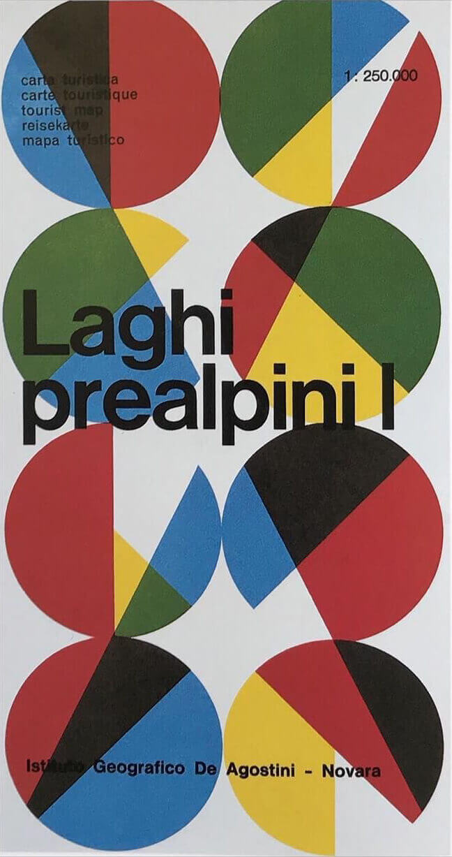
Laghi Prealpini - Max Huber - Archivio Max Huber Novazzano (CH)
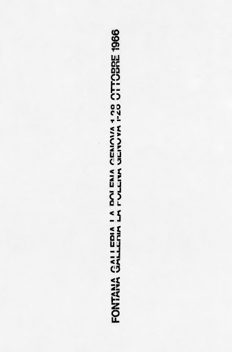
Poster for a Fontana Exhibition - AG Fronzoni - 1966
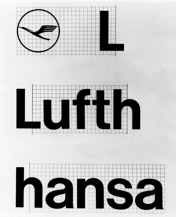
Lufthansa Visual Identity - Otl Aicher - 1969
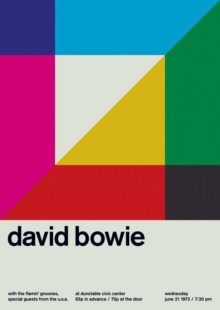
The most
famous Grotesk
Helvetica was designed in 1957 by Max Miedinger under the supervision of Edward Hoffman for the Haas foundry. The goal was to introduce an ungrateful typeface to the market that could compete with Akzidenz Grotesk. It was released shortly after Univers, but initially the font was called Neue Haas Grotesk, a name changed in 1961 to Helvetica for commercial launch by Stemper and Linotype.
In the same year the character spread beyond European borders to the United States. In a short time Helvetica became one of the most famous and used sans-serif fonts in the world.
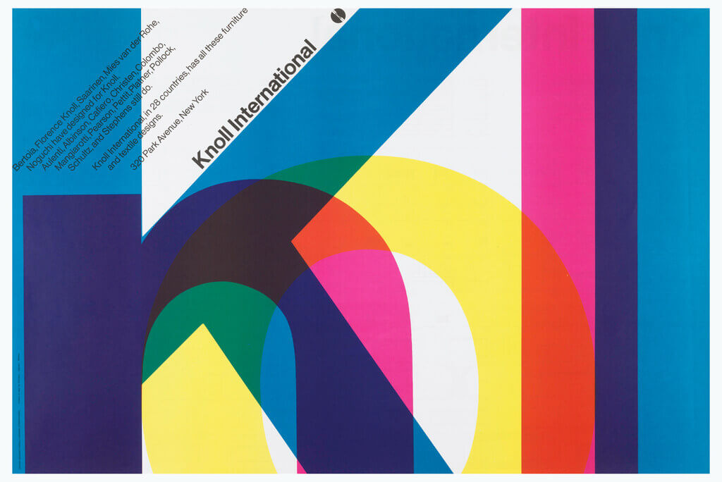
Knoll Corporate Identity - Massimo Vignelli - 1966
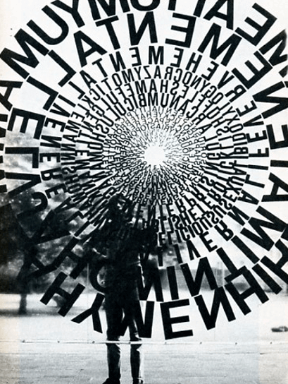
Ferdinand Kriwet - 1969
Chapter
Two

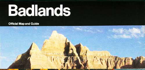
Origins of the project
Unigrid,
Massimo Vignelli
and American National Park
The Stelvio Grotesk was born drawing inspiration mainly from the Unigrid project (1977) by Italian designer Massimo Vignelli. This project allowed the American National Parks to have a single communication system, that until 1976 had been different for the whole of each park, forcing the American government to pay huge annual expenses for communication.
Massimo Vignelli designed a grid system that allowed anyone to easily make maps, brochures and any other printed material, without waste. We imagined how a similar system could work within the Italian National Parks, designing a font and a set of icons that could be used.

Unigrid by Massimo Vignelli
A tribute to the
beauty of Italy
Architecture, nature, art, literature, design and fashion, Italy is an inexhaustible source of beauty. Italy has always managed to express an incredible "visual poetics".At the end of the Second World War a real cultural exchange between Italian and Swiss designers began, some of the latter moved to Milan attracted by the nascent cultural and design climate. The Swiss brought their own design style and the Italians combined their creativity with it, starting a style that became unique in the world.
Albe Steiner, AG Fronzoni, Armando Testa, Giovanni Pintori, Bruno Munari, Massimo Vignelli are just some of the Italian designers/advertisers who managed to leave a deep imprint in world design as well as foreign designers who worked in Italy such as Bob Noorda, Max Huber, Bruno Monguzzi and others.
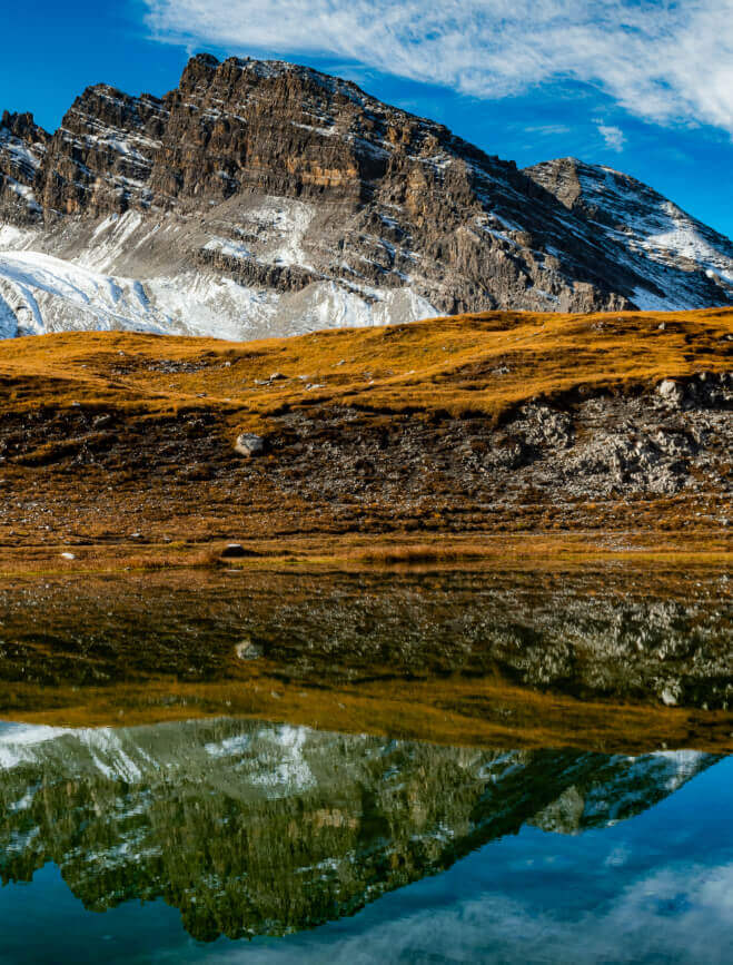
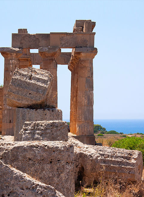
Photo by Ignacio Brosa
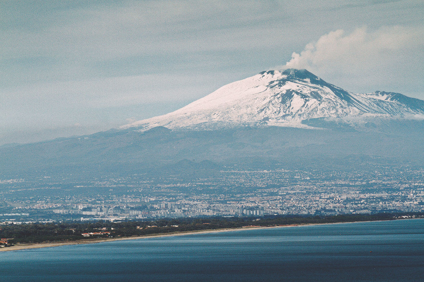
Photo by Samir Kharrat
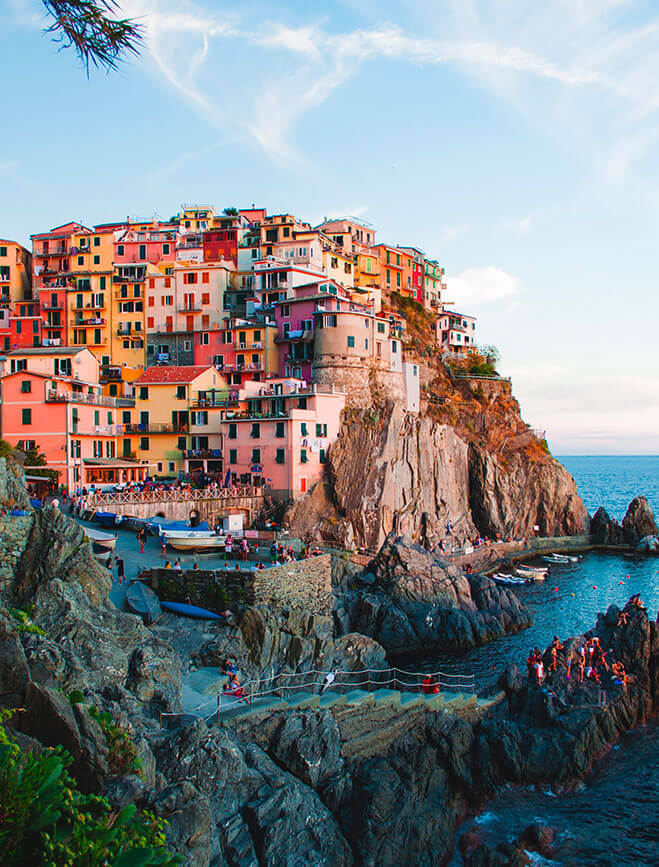
Photo by Jack Ward
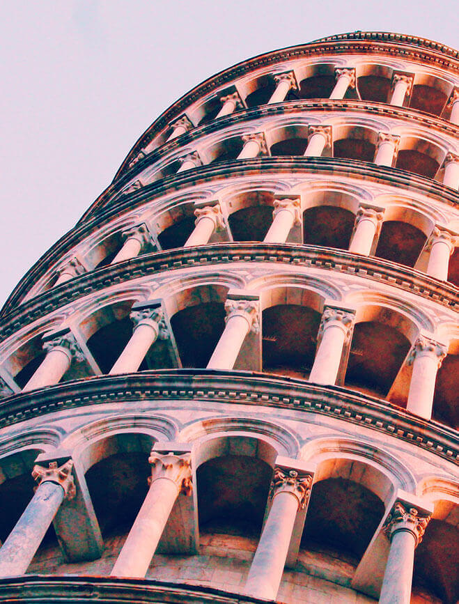
Photo by Alex Vasey
Chapter
Three
The Font
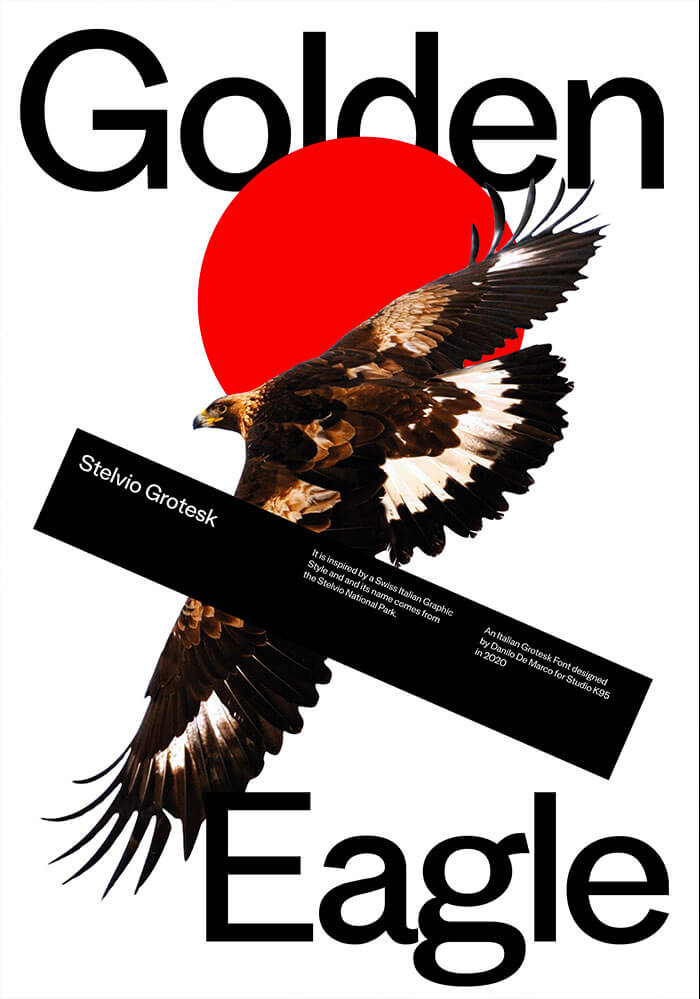
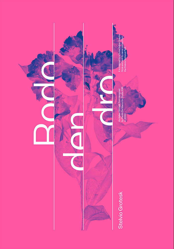
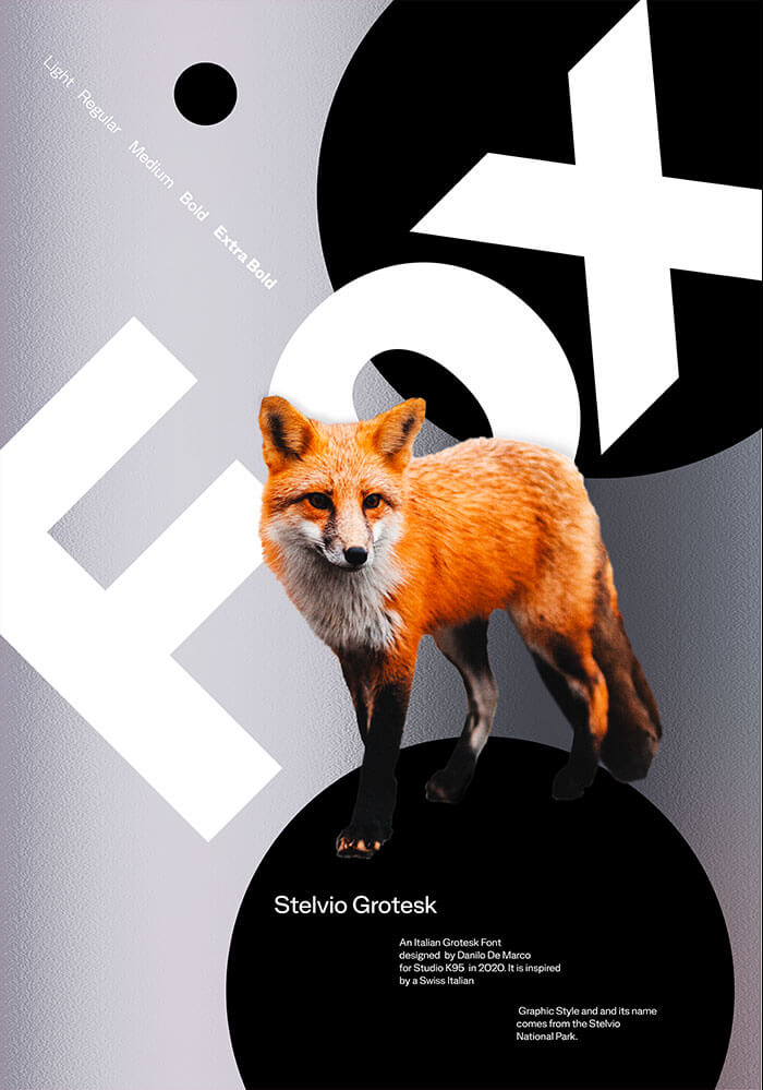
The Stelvio Grotesk is a modern sans-serif character designed by Danilo De Marco between 2018 and 2020 for Studio K95. It is the result of a long study of the Grotesk characters of the past, such as the already mentioned Akzidenz, Helvetica and Univers. The font is composed by 5 weights (Italic, Regular, Medium, Bold, Extra Bold), the Italic versions and a style we have called Stylus, ideal for titling and graphic uses.
Some letters of the font are characterized by sinuous strokes belonging to the romantic/modern Italian typographic tradition.
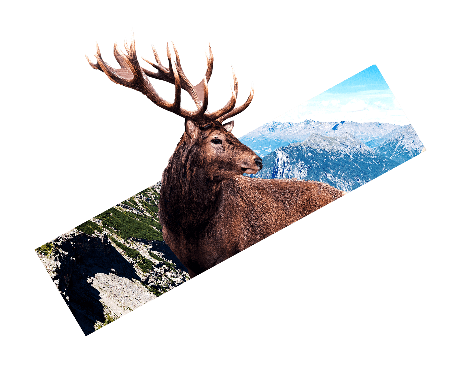
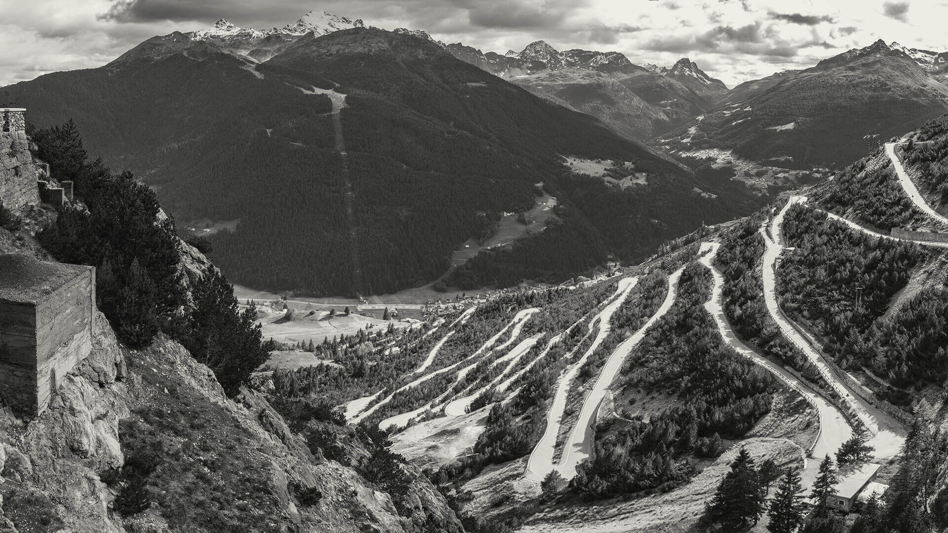
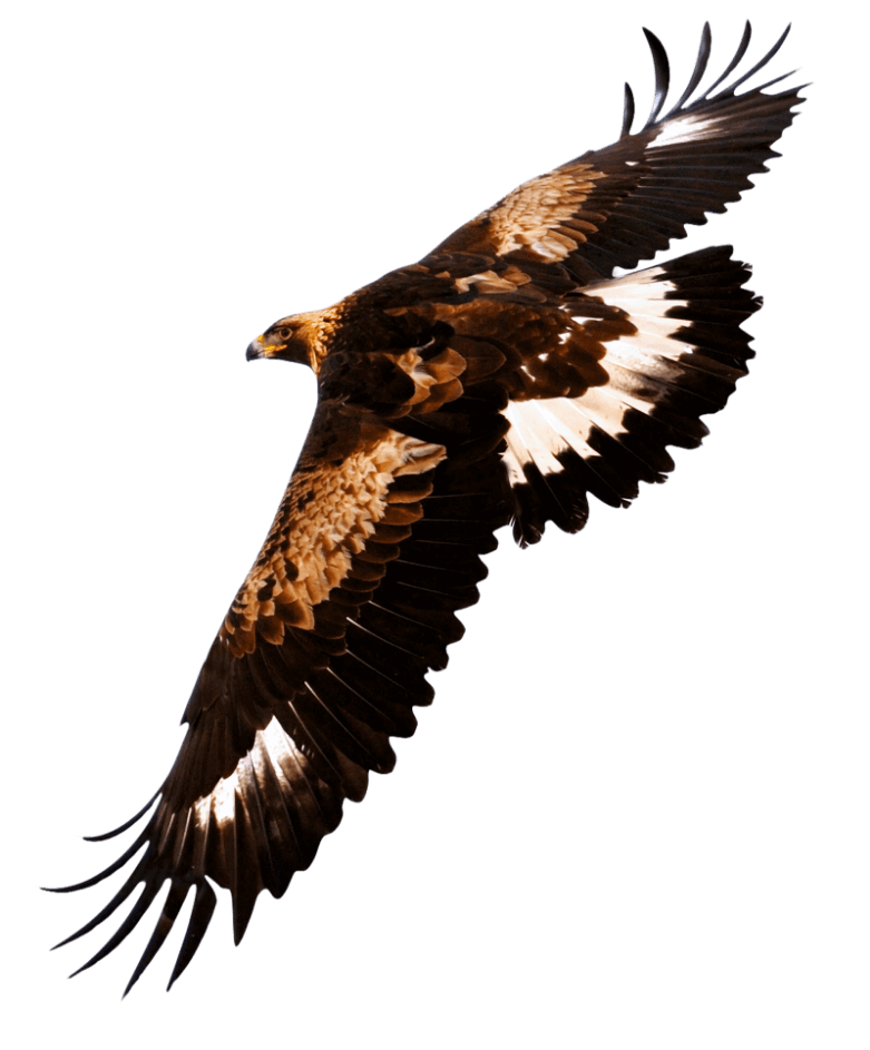
Golden Eagle
National Park
Hight Altitude
Central Alps
Great Fauna
Green Nature
When a lot of money comes along before culture arrives, we get the phenomenon of the gold telephone. And when I say culture I don’t mean academic knowledge, I mean information: information about what is happening in the world, about the things that make life interesting.
After Germany’s defeat in World War I and the establishment of the Weimar Republic, a renewed liberal spirit allowed an upsurge of radical experimentation in all the arts, which had been suppressed by the old regime. Many Germans of left-wing views were influenced by the cultural experimentation that followed the Russian Revolution, such as constructivism. Such influences can be overstated: Gropius did not share these radical views, and said that Bauhaus was entirely +apolitical.Just as important was the influence of the 19th-century English designer William Morris (1834–1896), who had argued that art should meet the needs of society and that there should be no distinction between form and function.[6] Thus, the Bauhaus style, also known as the International Style, was marked by the absence of ornamentation and by harmony between the function of an object or a building and its design.
However, the most important influence on Bauhaus was modernism, a cultural movement whose origins lay as early as the 1880s, and which had already made its presence felt in Germany before the World War, despite the prevailing conservatism. The design innovations commonly associated with Gropius and the Bauhaus—the radically simplified forms, the rationality and functionality, and the idea that mass production was reconcilable with the individual artistic spirit—were already partly developed in Germany before the Bauhaus was founded. The German national designers’ organization Deutscher Werkbund was formed in 1907 by Hermann Muthesius to harness the new potentials of mass production, with a mind towards preserving Germany’s economic competitiveness with England. In its first seven years, the Werkbund came to be regarded as the authoritative body on questions of design in Germany, and was copied in other countries. Many fundamental questions of craftsmanship versus mass production, the relationship of usefulness and beauty, the practical purpose of formal beauty in a commonplace object, and whether or not a single proper form could exist, were argued out among its 1,870 members (by 1914).
When a lot of money comes along before culture arrives, we get the phenomenon of the gold telephone. And when I say culture I don’t mean academic knowledge, I mean information: information about what is happening in the world, about the things that make life interesting.
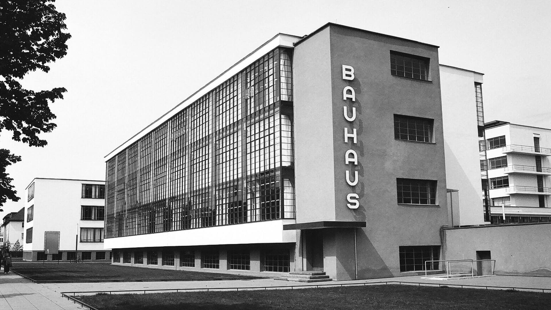
A Bauhaus style building in Chemnitz German architectural modernism was known as Neues Bauen. Beginning in June 1907, Peter Behrens’ pioneering industrial design work for the German electrical company AEG successfully integrated art and mass production on a large scale. He designed consumer standardized parts, created clean-lined designs for the company’s graphics, developed a consistent corporate identity, built the modernist landmark AEG Turbine Factory, and made full use of newly built the modernist landmark AEG Turbine
Factory, and made full use of newly developed materials such as poured concrete and exposed steel. Behrens was a founding member of the Werkbund, and both Walter Gropius and Adolf Meyer worked for him in this period.
The school was founded by Walter Gropius in Weimar on 1 April 1919, as a merger of the Weimar Saxon Grand Ducal Art School and the Weimar Academy of Fine Art. Its roots lay in the arts and crafts school founded by the Grand Duke of Saxe-Weimar-Eisenach in 1906, and directed by Belgian Art Nouveau architect Henry van de When van de Velde was forced to resign in 1915 because he was Belgian, he suggested Gropius, Hermann Obrist, and August Endell.


Character
Set
Uppercase
A B C D E F G H I J K L M N O P Q R S T U V W X Y Z À Á Â Ã Ä Å Ç È É Ê Ë Ì Í Î Ï Ð Ñ Ò Ó Ô Õ Ö Ù Ú Û Ü Ý Ā Ă Ą Ć Ĉ Ċ Č Ď Ē Ĕ Ė Ę Ě Ĝ Ğ Ġ Ģ Ĥ Ĩ Ķ Ĺ Ļ Ľ Ŀ Ł Ń Ņ Ň Ŋ Ō Ŏ Ő Ŕ Ŗ Ř Ś Ŝ Ş Š Ţ Ť Ŧ Ũ Ū Ŭ Ů Ű Ų Ŵ Ŷ Ÿ Ź Ż Ž Ǻ Ș Ẁ Ẃ Ẅ Ỳ
Lowercase
a b c d e f g h i j k l m n o p q r s t u v w x y z à á â ã ä å ç è é ê ë ì í î ï ñ ò ó ô õ ö ù ú û ü ý ā ă ą ć ĉ ċ č ď ē ĕ ė ę ě ĝ ğ ġ ģ ĥ ĩ ķ ĺ ļ ľ ŀ ł ń ņ ň ŋ ō ŏ ő ŕ ŗ ř ś ŝ ş š ţ ť ŧ ũ ū ŭ ů ű ų ŵ ŷ ÿ ź ż ž ǻ ș ẁ ẃ ẅ ỳ
Numbers, Superiors, Fractions
0 1 2 3 4 5 6 7 8 9
¹ ² ³ ¼ ½ ¾ ⅓ ⅔ ⅛ ⅜ ⅝ ⅞
Other Glyphs
! “ # $ % & ‘ ( ) * + , - . / : ; < = > ? @ [ \ ] ^ _ ` { | } ~ ¡ ¢ £ ¥ § ¨ © « ® ¯ ° ± ´ ¶ · ¸ » ¿ Ø Þ ß ð ÷ ø Ħ ˆ ˇ ˘ ˙ ˚ ˛ ˜ ˝ – — ‘ ’ ‚ “ ” „ † ‡ • … ‰ ‹ › ⁄ € ℗ ™ − ≈ ≠ ≤ ≥

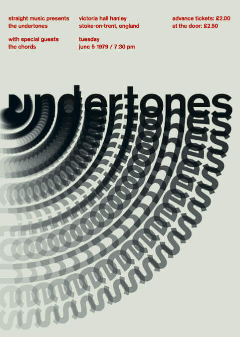
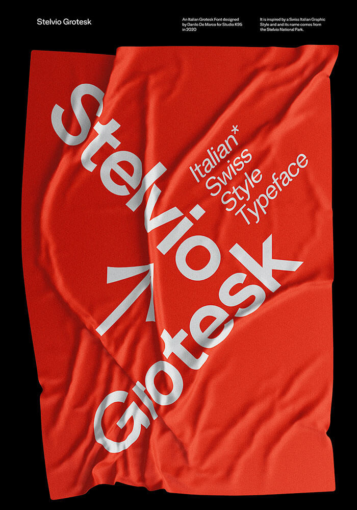
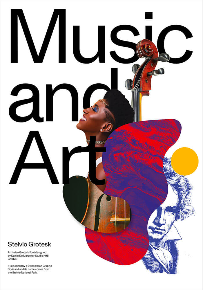
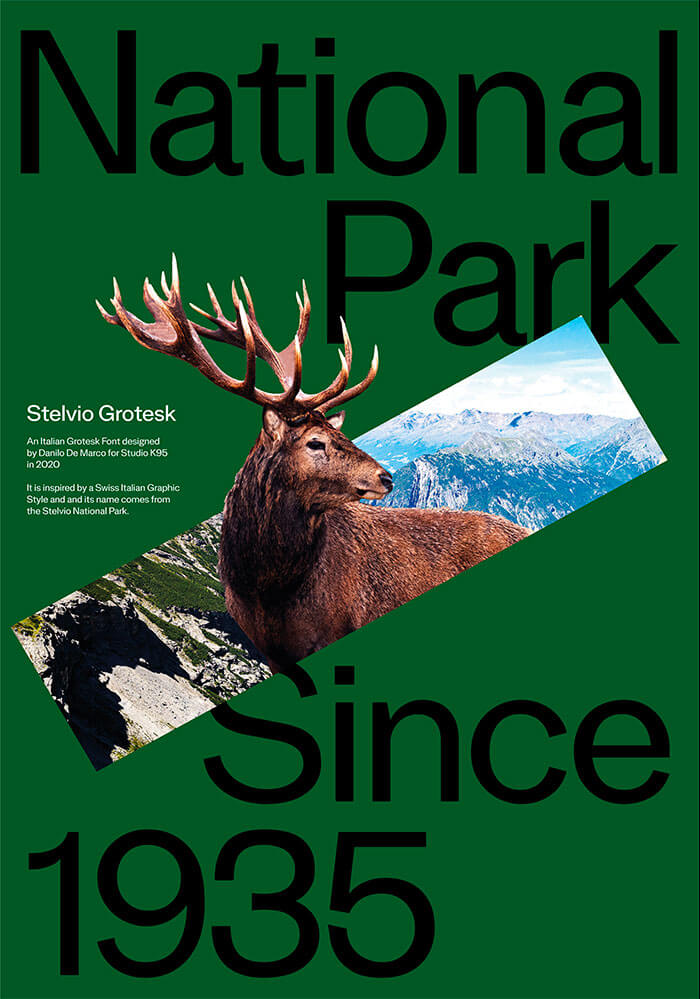
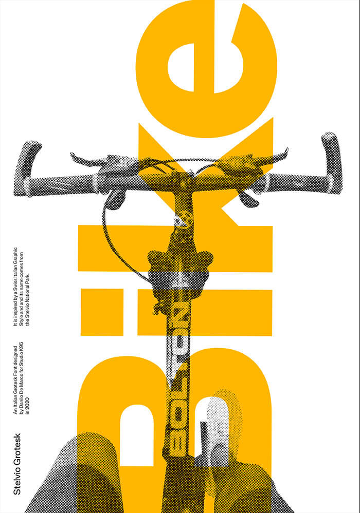
The Posters
We designed 10 posters for advertise the Stelvio Grotesk. We were inspired by nature, fauna and activities in the Stelvio Natural Park. These posters show the use of the font as a graphic component and not only textual, their design has helped us in the last phases of realization.


Chapter
Four
The Icons
Danilo De Marco and Giulia Gambino designed a set of 70 icons that they named Stelvio Icons. The icons are suitable for use within wayfiding systems, but initially they were designed to be used within a system for nature parks. Later we designed other icons that could be used within urban systems such as metro, airports, stations and others.
The design of the icons, in outline, is inspired by the shapes of the letters of the Stelvio Grotesk and the entire set comes in four different thicknesses (Light, Regular, Medium, Bold).

Designed by
for Studio K95
-
Buy on
- info@K95.it
©2020 Studio K95 and Danilo De Marco